Your audience decides whether they’ll keep watching your video in the first few seconds. Strong lower thirds reinforce your brand, clarify key information, and show viewers that you’re serious about quality.
The problem is that creating lower thirds from scratch takes hours, and generic text overlays often scream “amateur hour”.
In this article, you’ll learn everything you need to know about lower thirds. We’ve also curated Storyblocks’ best ready-to-use designs that you can drop straight into your projects.
Table of contents
What is a lower third?
A lower third is a graphic overlay that appears in the bottom part of your video frame, showing names, titles, or other important information. The term comes from television, where editors divide the screen into three sections. Editors place the graphics in the bottom part to avoid interfering with the main subject on screen.
Static lower thirds are simple overlays that appear and disappear without movement. Animated lower thirds can include transitions or motion that draws attention, but they require more processing power and can date your content faster.
Where’s the best place to put your lower third?
You should position lower thirds in the “safe area”, about one-third up from the bottom of your frame. This will prevent your motion graphic from being cut off on different screen sizes. Here’s what a typical lower third might look like:

It’s a good idea to leave breathing room around the edge and maintain a clear hierarchy, with larger text for names and smaller text for titles or descriptions.
In other words, try to avoid what Ron Burgundy was going for in Anchorman 2:
Remember: legibility trumps creativity. Use high contrast between text and background, readable fonts, and consistent sizing. If your footage has busy backgrounds in the lower third area, you can add a subtle backdrop or shadow to keep your text crisp.
What’s the purpose of lower thirds?
Lower thirds tell viewers what they’re watching and why they should care. They also set the tone for your content.
Interviews need them most. Viewers want to know who’s talking and what makes them worth listening to. B-roll footage often needs explanation too. Lower thirds explain what location we are seeing and what is happening on screen.
Social posts work well with handles or key takeaways, and live streamers also use lower thirds to welcome new viewers or make announcements.
Your lower thirds should match the energy of your content. Corporate videos call for clean designs that don’t steal focus from the speaker. YouTube channels can often go bigger and use more animation. Whatever style you pick, stick with it throughout your project. Switching styles randomly can make your content look unprofessional.
Elements of a lower third
Lower thirds might look simple, but they’re made up of several key components that can make or break your design.
- Typography sets the mood of your lower third and determines how easily viewers can read your text. Poor font choices kill readability faster than anything else.
- Shapes and logos create visual separation between your text and the background footage. They also give you a chance to reinforce your brand without being obvious about it.
- Color keeps your text visible against different types of footage and backgrounds. The wrong color choices can make your lower thirds disappear or clash with your content.
- Size and position determine whether your graphics work on phones, tablets, and TVs. Get this wrong and your text gets cut off or becomes unreadable on smaller screens.
- Animation adds polish and personality to your lower thirds. It can make the difference between graphics that feel cheap and ones that look professionally produced.
Storyblocks’ curated lower third templates
Here are Storyblocks’ best lower thirds organized by the situations you’ll actually use them in to make it easier for you to choose a template. For each, we’ve provided a preview of the template and what editing software it works with, so you can grab what you need and get back to editing.
Breaking news lower thirds
Fast-paced news content needs graphics that feel urgent without being chaotic. The News Minimal Lower Thirds template works perfectly for Premiere Pro users who want clean, readable text with subtle animation.
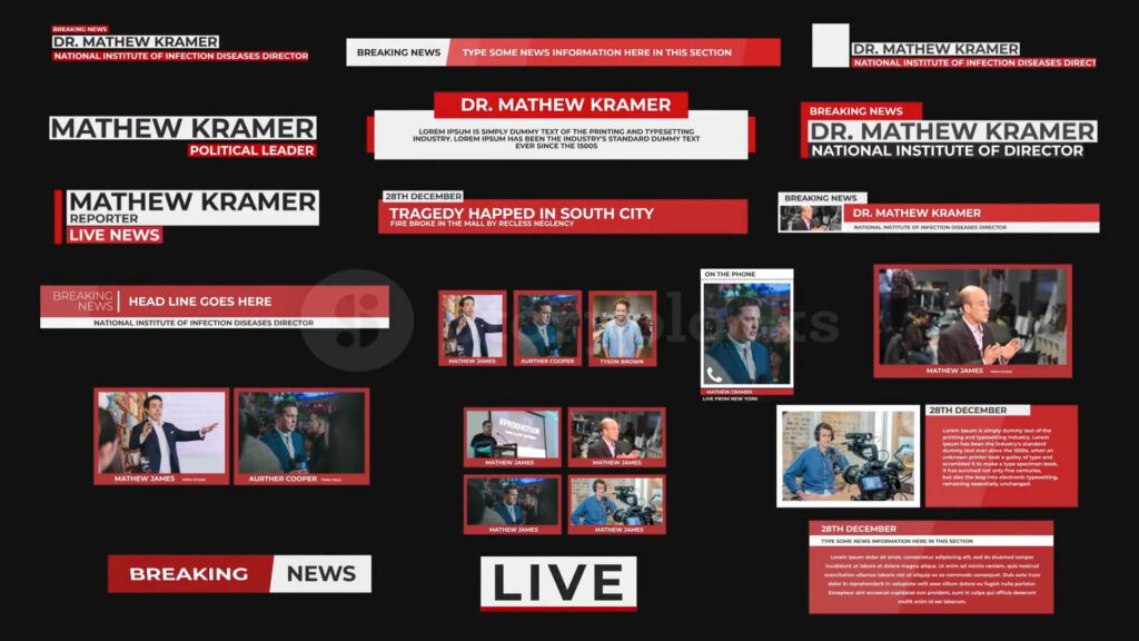
For more dramatic breaking news segments, try the Breaking World News Graphic Pack in After Effects, which includes animated elements that grab attention.
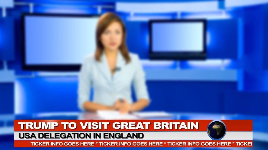
DaVinci Resolve users can use News Tickers V02 for scrolling updates and standard lower thirds.
Social media lower thirds
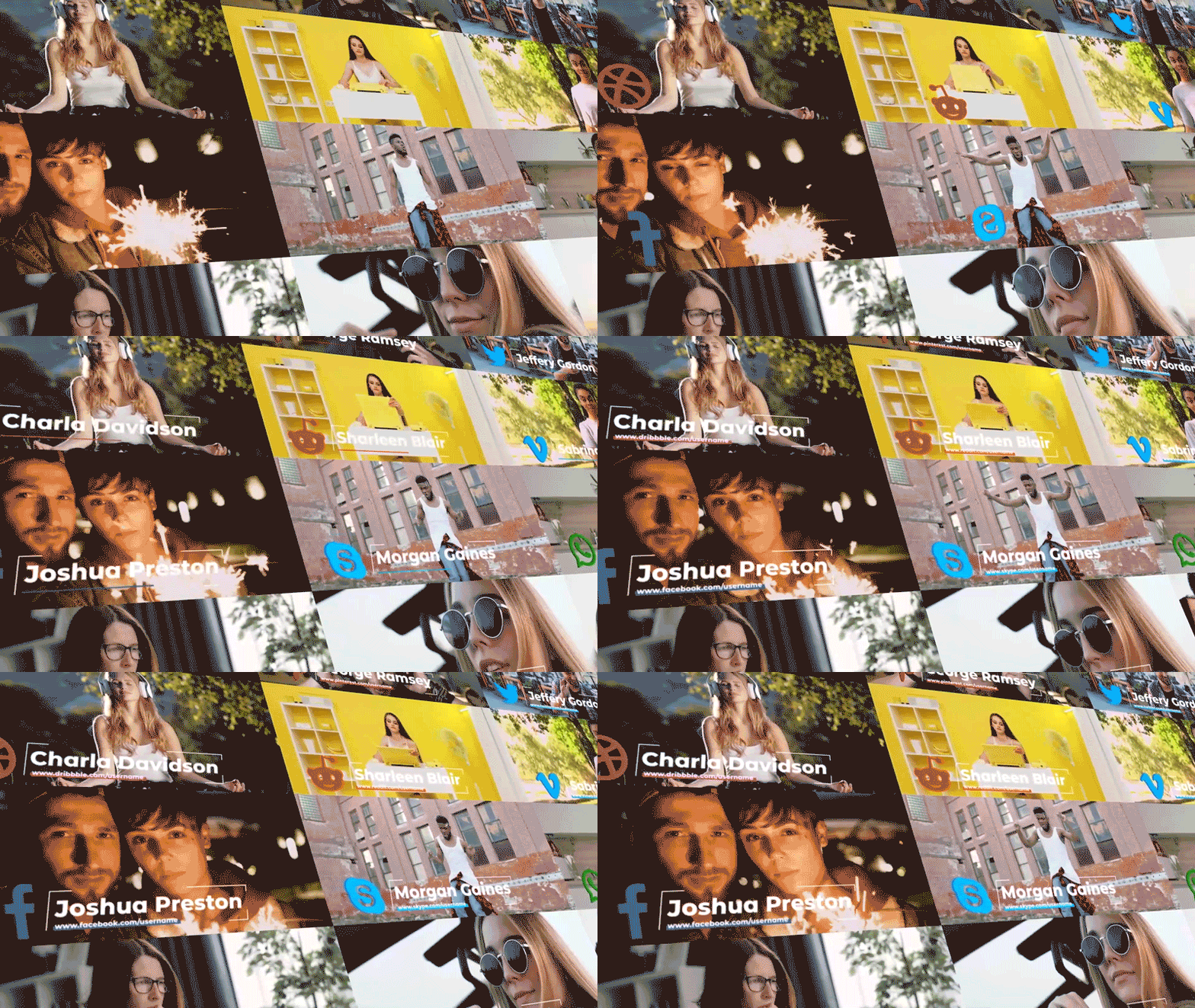
Social content needs graphics that pop on small screens and match platform aesthetics. They can also be used to promote your other social media channels or accounts. The Cinematic Titles After Effects template has a selection that works great for Instagram stories and TikTok videos and gives them a premium feel.
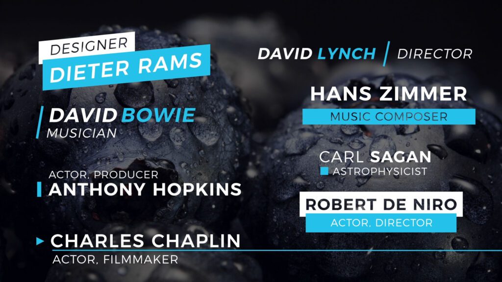
Premiere Pro users should check out 60 Social Media Lower Thirds, which gives you tons of variety based on different social media sites.
DaVinci Resolve editors can use Social Media Lower Thirds for colorful, animated options.
Documentary lower thirds
Documentary work requires understated graphics that inform without distracting from your story. The Modern Lower Thirds Premiere Pro template offers clean typography with smooth transitions.
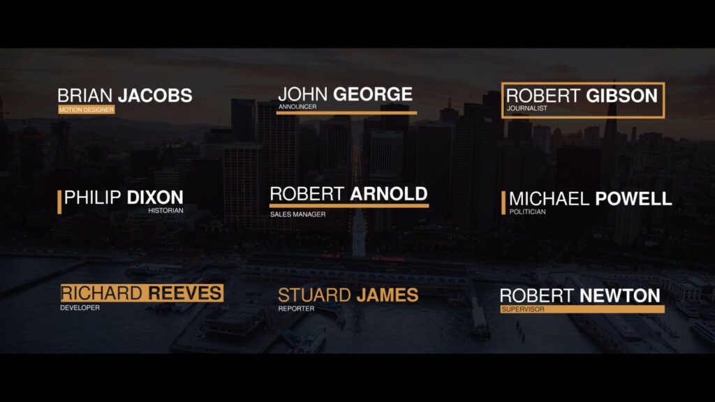
For black and white or minimal color schemes, try Monochrome Lower Thirds in DaVinci Resolve.
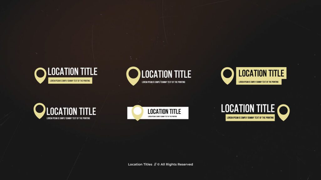
Final Cut Pro and Apple Motion users can use Location Titles for establishing shots and interview segments.
Corporate lower thirds
Business videos need professional graphics that reflect your brand’s credibility. The Corporate Lower Third After Effects template delivers exactly what most companies need with customizable colors, images, and text.

DaVinci Resolve users should try Minimal Lower Thirds for presentations and training videos.
Finally, Final Cut Pro editors can use Corporate Lower Thirds for boardroom presentations and company announcements.

Religious lower thirds
Religious content benefits from graphics that feel reverent and inspiring. The Light Worship Broadcast Package includes lower thirds along with other broadcast elements for After Effects users.
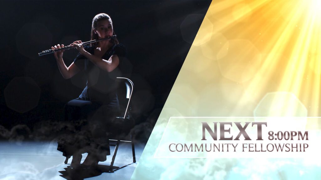
For scripture quotes and inspirational messages, try Quotes Lower Third in DaVinci Resolve, which works perfectly for highlighting verses or key teachings.
How to use Storyblocks templates
Most Storyblocks lower thirds come as ready-to-use files for different editing software. Whether you’re working in Premiere Pro, After Effects, DaVinci Resolve, or Final Cut Pro, you can typically drag the template into your timeline and customize the text through your editor’s graphics panel.
.Mogrt files are especially useful for Premiere Pro users because they let you reuse the same design with different text throughout your project. You can change colors, adjust timing, and swap out content without touching the original template.
For a detailed walkthrough on importing and customizing templates, check out our guide on how to use lower third templates in Adobe Premiere. If you’re working with After Effects, learn how to turn an AE graphic into a .mogrt file for Premiere Pro to streamline your workflow.
You can also watch our webinar with Premiere Gal where Kelsey Brannan covers how to make and edit MOGRTs.
Get unlimited lower thirds templates
Now you know how to choose and add lower thirds. These graphics are just one piece of professional video production, but they make a huge difference in how viewers perceive your content.
Try out the curated templates we’ve highlighted first. They’ll handle most situations without any customization needed. If you need something more specific, you can always change the colors, fonts, and animations to match your style.
With a Storyblocks subscription, you get unlimited access to these lower third templates plus thousands of other motion graphics and video assets. You don’t have to do any design work, just drag-and-drop your chosen templates and add the polishing touches. And with the Storyblocks plugin, you don’t even have to leave your editor.